
well thank you very much for that
introduction and thank you very much for
making me a professor I’m only an
assistant professor but professors
sounds good
I’ll keep it so I’m very glad and very
honored to be here today and I do that’s
my educational background but nowadays I
actually what I do most is education I’m
a teacher and I teach global health and
I am a teacher really really like
statistics just like you said and I’m
into numbers and graphs so I just come
in here to this places it’s like heaven
I can teach you global health and I can
use my graphs and you may be like them
and so teaching global health is trying
to show you how health varies globally
how health varies in the world how
health varies between countries and I
will do that today showing you only one
graph but I will also show you how
health the differs not only between
countries but within countries between
majority and minority populations and
knowing the background knowing what
things look like when it comes to health
is a good condition or is a condition to
then start talk about integration you
need to have the basic facts first so I
said I would talk about health what is
health it’s health just the opposite of
disease the opposite of death there is
quite a clear w/o definition health is a
state of complete physical mental and
social well-being I take it again health
is a state of complete physical mental
and social well-being have you ever been
in perfect health according to that
definition I have once
let me tell you when that was it was
actually my last few days in high school
just before I was to graduate I was on
my way to school
biking biking down a hill the Sun was in
the air the birds were singing it was
quite warm and I was so happy I knew it
was really my last days of school and as
I was biking down this hill with the air
in my hair that was before I became an
adult started using a bike helmet
I really felt exactly like that like
that definition I was in perfect health
and then at the bottom of the hill there
was this tiny little patch of gravel you
know that those little patches of gravel
that are still there after the winter
and I didn’t see it so I was turning
just wear that patch was of gravel and I
slipped and I fell and I hurt my knee I
didn’t hurt myself that but my I
scratched my bike so I was really
worried what would my parents say how
was I to afford to fix the bike and just
like that within less than one second
I lost my perfect state of health now I
hope you have all yourself try to
remember when you were in perfect health
anyone in perfect health tonight no okay
maybe that’s that um but how do we
measure health should we measure it as
just the absence of the disease or death
or should we try to go more for the wgo
definition which would be more something
like the dross National Happiness index
that is popular in Bhutan well actually
in global health we go for something in
between we use average life expectancy
an average life expectancy is an
interesting measure it is the average
life expectancy of let’s take a baby
born in Sweden today in Stockholm today
maybe a dumbbell where I spend half of
my time so we have a baby born today and
it’s a girl
this baby girl can expect to live on
average 84 years if you spurn today
which is pretty amazing 84 years 8 years
if it’s a boy which is still pretty good
so the average life expectancy for
Sweden is 8 to 2 years today that is for
a baby born today if all the conditions
remain the same conditions never remain
the same we all have technological
improvements we have sometimes we have
epidemics that strike like the Spanish
flu we have amazing medical discoveries
with new cures but if all everything
remains the same today that is what we
call the average life expectancy and it
is quite a good measure of what type of
health and health care we can offer the
baby born in Sweden today so with what
we have today on average this little
baby girl will live 84 years so average
life expectancy that is it’s not a
perfect measure we don’t know exactly
that it is 80 4.03 in Sweden but it’s
around there plus – and when we want to
see the big picture we want to compare
between countries it’s a good enough
measure so now I’ve introduced you to
health and perfect health and how we
measure health now it’s time to show you
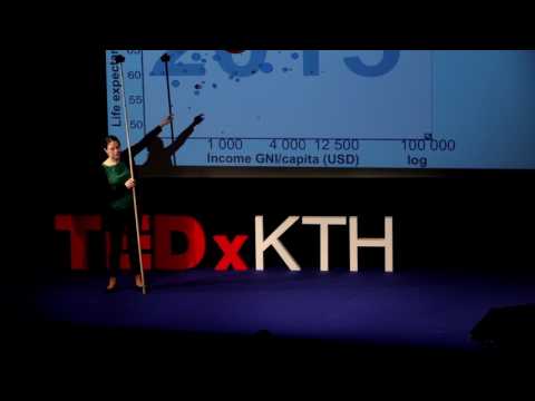
my graph you might have seen this graph
before because this is a Gapminder graph
and it has been shown by Hans Rosling
ruler rustling I’m not willing and the
other Gapminder professionals before but
let me take you through it and to do
that I need a stick to show you properly
so this is the whole world in one graph
on the vertical axis we have average
life expectancy because it ranges from
50 all the way up to 80 of there even
82.5 and then on this axis on the
horizontal axis we have income per
capita so it goes all the way from Z
after 100,000 on a log scale and then we
have all the bubbles here which
represents countries of the world there
are about 200 countries in the world
there about 200 bubbles in this chart so
each bubble represents a country and the
size of the bubble represents the size
of the population of the country big
bubble means big population and then we
have the color of the bubble which
represents what region the country
belongs to and you have the green
countries you have the map over there so
you can see but you have all the green
countries they are the Americas you have
the yellow countries European countries
the blue bubbles they are African
countries and the red ones are Asian
countries and with these facts you
should be able to figure out the two big
red bubbles this one and this one they
are Indian China so when we look at this
you can see that there’s a clear
relation between how rich a country is
and how long people live in that country
how healthy they are in that country
right because there are no countries up
here that live long and have no money
and there are no countries down here
that have a lot of money but but do not
live long there’s a clear relation
between health and money right but to
make some kind of to make it more
comprehensible when we show this graph
and we use it we want to divide the
world into categories so we can talk
about countries in the same cattery
category we can compare it with
countries in other categories and before
in the old times maybe what you learnt
is cool we talked about developing
countries and developed countries can
you draw a line here and tell me where
that line is when does a country cross
the line of becoming a developed country
is it here
is it here is it here can’t really say
can you there’s no really intuitive way
of doing it is it that we don’t use the
terms developing and developed anymore
but somehow they these this terminology
has been so popular that it has stuck
and you will meet it everywhere even
within global health people still use it
but in official terms the World Bank for
instance they don’t use it anymore so
hopefully more and more we’re gonna
leave this terminology behind instead
what we do is we use World Bank income
categories and when we do that all the
countries that have an income above
$12,500 become high-income countries 1
billion people live in high-income
countries and here you find a big green
bubble that’s the u.s. a big red bubble
Japan and most of the yellow bubbles
European countries then we have the
upper middle income countries with 2.5
billion people how many people are there
in the world about 7 so 2.5 billion
people live in upper middle-income
countries and here we can find a country
like China and then we come to the lower
middle-income countries where another
2.5 billion people live and here you can
find a country like India and finally
the last billion live in low-income
countries where you find a country like
the Democratic Republic of Congo so four
categories and most of the people most
of the 7 billion 5 billion they live in
the middle there’s 1 billion of their
high income there’s 1 billion down here
ok but you cannot see that even though
there are clear differences between the
categories there are also differences
within each category you can take a
country in the lower middle income
category here like Vietnam and
parrot to Nigeria down here they have
almost the same income but very
different life expectancies so I said
there’s a clear relation but it seems to
be important what you do with the money
that you have so just to show you the
average life expectancy in low-income
countries it’s 61 in lower middle
67 in upper middle 74 and in high-income
countries 81 so very close to the
Swedish average and Sweden is one of the
it’s actually the yellow bubble up there
it’s 82 and now you have the world in
front of you now what we’re going to do
we are going to look at countries and
within countries and compare majority
and minority populations so let’s see
let’s start with the u.s. in the u.s.
there are quite a few minorities I will
only take a look at the indigenous
population of the US and the u.s. in the
average life expectancy in the u.s. is
79 years the indigenous population in
the US has a life expectancy of 74 it’s
about five years lower it’s this typical
only for the u.s. let’s take a look at a
few other high-income countries with
minority populations first you take a
look at Denmark our neighboring country
which has within the Kingdom of Denmark
you can find the autonomous country of
Greenland which is a huge island in the
Arctic and about 1% of the population in
all of Denmark lives in Greenland and
most of them are into it life expectance
in Denmark is 80 and in Greenland it’s
finally take a look at Australia in
Australia we have the same life
expectancy as a Sweden it’s 82 and the
indigenous population of Australia it’s
10 years less 10-year of a difference
here so why do even though we have
Australia we have Denmark we have the US
why do the indigenous populations of
these countries lives much shorter than
the majority populations they’re very
tiny parts of the countries in a whole
they make up 1 to 3 percent of the
population but why do they live so much
shorter there seems to be something
happening with integration into modern
life there seems to be consequences of
it so if you go to look to see what the
causes of disease and death are in these
indigenous populations you will find out
that the rates of alcohol related
diseases are much higher in indigenous
populations and also that suicide rates
are much higher indigenous populations
there also seems to be diseases related
to too little integration and that is
what do I mean by that – little
integration that with that I mean infant
mortality child mortality is somewhat
higher in indigenous populations than it
is in the majority populations and –
this is because lack of proper access to
health care it’s not much higher but it
is higher in all these 3 indigenous
populations so – men too much or too
little integration ok we looked at
high-income countries now let’s take a
look at upper middle income countries
and I’ll keep the US as a reference and
for upper middle income countries
I choose Romania instead of China
because Romania has a minority that has
become quite well-known to us here in
Sweden Romania has the Roma as a
minority and the Roma they constitute
about 3% of the Romanian population many
of the Roma
if you have in search of a better life
come to Sweden so therefore they’re
quite well-known to us so how is life
expectancy for the Roma let me first
tell you it’s not easy to find date on
these things that’s my job I try to find
data every day for different types of
health statistics but when it comes to
looking for minorities it’s not easy and
why is that is it because governments
don’t want to know well in some cases
maybe yes but also to collect data on
minorities the person who identifies as
belonging to a minority must also report
that he belongs to this minority when
the data is collected and in many cases
this is not happening so it’s it’s quite
a lot of underreporting going on
you know Romania has a life expectancy
reflecting all the social or the
cultural or the educational differences
between the Roma population and the
majority population in Romania what
about lower middle income countries here
we go for India and in India there are
so many different minorities and
hundreds of them and they actually call
themselves a lot of them they belong to
something called scheduled tribes and
sometimes when we talk about tribes we
think that that’s something of the past
colonial but this is the official name
scheduled tribes there are big scheduled
tribes like the Gujarati with several
million people belonging to them and
there are small scheduled tribes with
only a few hundred members and the life
expectancy of the scheduled tribes is
not that low actually it’s about
comparing to India which is 67
it’s about 63 to 64 so 3 to 4 years less
and I did not find when I looked through
all the data I did not find any country
with a life expected to lower the life
and then finally let’s go to low-income
countries
and look at Congo the Democratic
Republic of Congo and I choose Congo
Congo is close to my heart
I worked there as a doctor as of several
years ago and I really got to see with
my own eyes
the reason why the life expectancy in
Congress only 58 we have a high maternal
mortality mother’s die it’s horrible
mother’s side children die from diseases
that are easily treatable life
expectancies 58 in Congo there are also
many many many minorities and some of
them live in the rainforest one of them
is a group called the FF pygmies or the
FE people and the life expectancy now
we’re not talking about data now we’re
talking about expect of estimations or
observations of people who have lived
with Fe pygmies it’s one somewhere down
here I think actually it’s rather down
there but I couldn’t fit that into my
graph so it’s here it’s probably about
30 to 35 so more than 20 years less than
the life expectancy of Congo so now that
we have this is my final graph now that
we have it all in front of us what
conclusions can we draw but can we see
when we have this in front of us well
first of all if we take a look at the
countries the high-income countries and
the upper middle income countries we see
that we have these big differences
between minority and majority
populations with up to ten years
difference in life expectancy right you
can also say that it seems like in lower
middle-income countries these
differences are not as big because most
people have access to basic health care
and going to school when taking in just
an example at least there are still
differences but they’re not as big here
the majority populations have access to
the best form of health care and then we
have a life expectancy like this and
finally the life expectancy of the F
epidemy is 30 to 35
sometimes we tend to talk about these
but people living in the rainforest as
we’d romanticize they live in ecological
balance with the nature it’s fantastic
let me take a look at this and what you
see is that they do not live in
ecological balance with nature at the
diary like illogical balance with nature
child mortality of 40% more than half
sometimes of the children do not ever
reach adult age so that we also can
maybe not see in this picture but what
we know from history is that all the
countries in the lower middle upper
middle and high-income countries what
they have done is that as they have
become richer and healthier they have
taken the minorities with them so the
health of the minorities have become
better at the same time as the health of
the majority populations and actually as
the countries have become richer the gap
has become smaller and there is no
example of a country that first achieved
perfect equal health for everyone and
then started to rise all these countries
have been raised a rising with some
people having a higher better health and
some people having lower health but
raising rising together and my take-home
message is I would like you to keep two
thoughts in your mind at the same time
if you can do that first of all it’s
horrible that we have these 10 year
different system there are differences
between minorities and majorities
they’re still there they’re there
they’re clear you’ve seen them but there
is no minority in all these three income
groups that has a lower life expectancy
than the average life expectancy of
low-income countries than the average
don’t forget the low-income countries so
keep this spectrum in your in your heads
and that will make my day as a teacher
thank you very much [Applause]